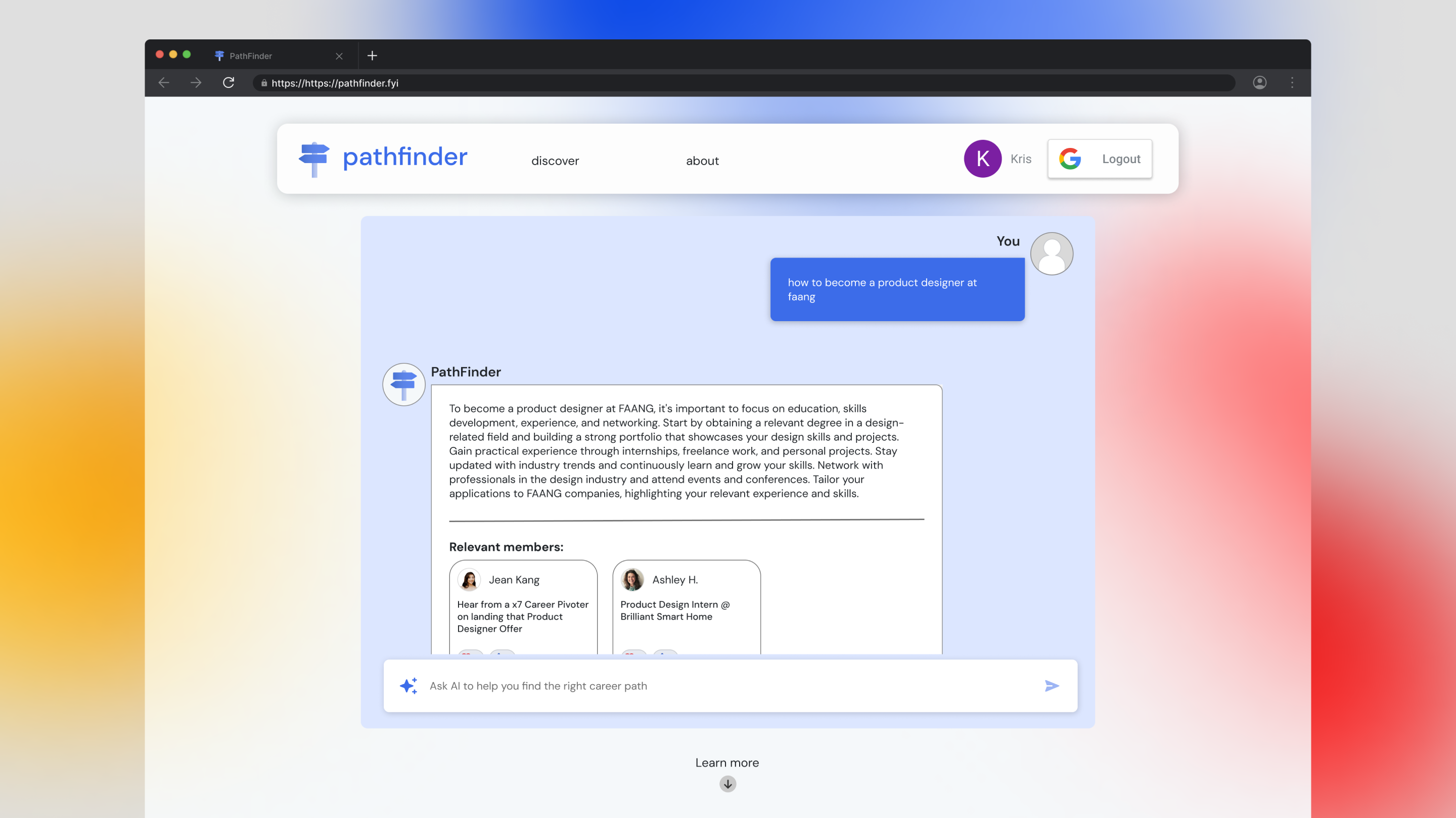
PathFinder
Redefining the discovery experience for students and career switchers to discover career stories
Role
UX/UI Designer - Product Strategy, Research, UX Design, Prototyping, Visual Design, Design system, Handoff Documentation
Team
1 Product Manager, 2 UX/UI Designers, 7 Engineers
Duration & Status
4 months
Launched on Mar 2024
Overview
Having a community of professionals to add and share stories of their work experience helps students and career switchers learn about the professionals' experience so they can be prepared earlier in their career journey.
I led the end-to-end design direction of redesigning the Discover page. Redesigning the Discover page will improve the discovery experience and save time finding stories.
This results in a 100% task completion rate, 80% satisfaction rate, and a reduced bounce rate by 20% on the Discover page.
100%
task completion rate
80%
satisfaction score
20%
reduced bounce rate
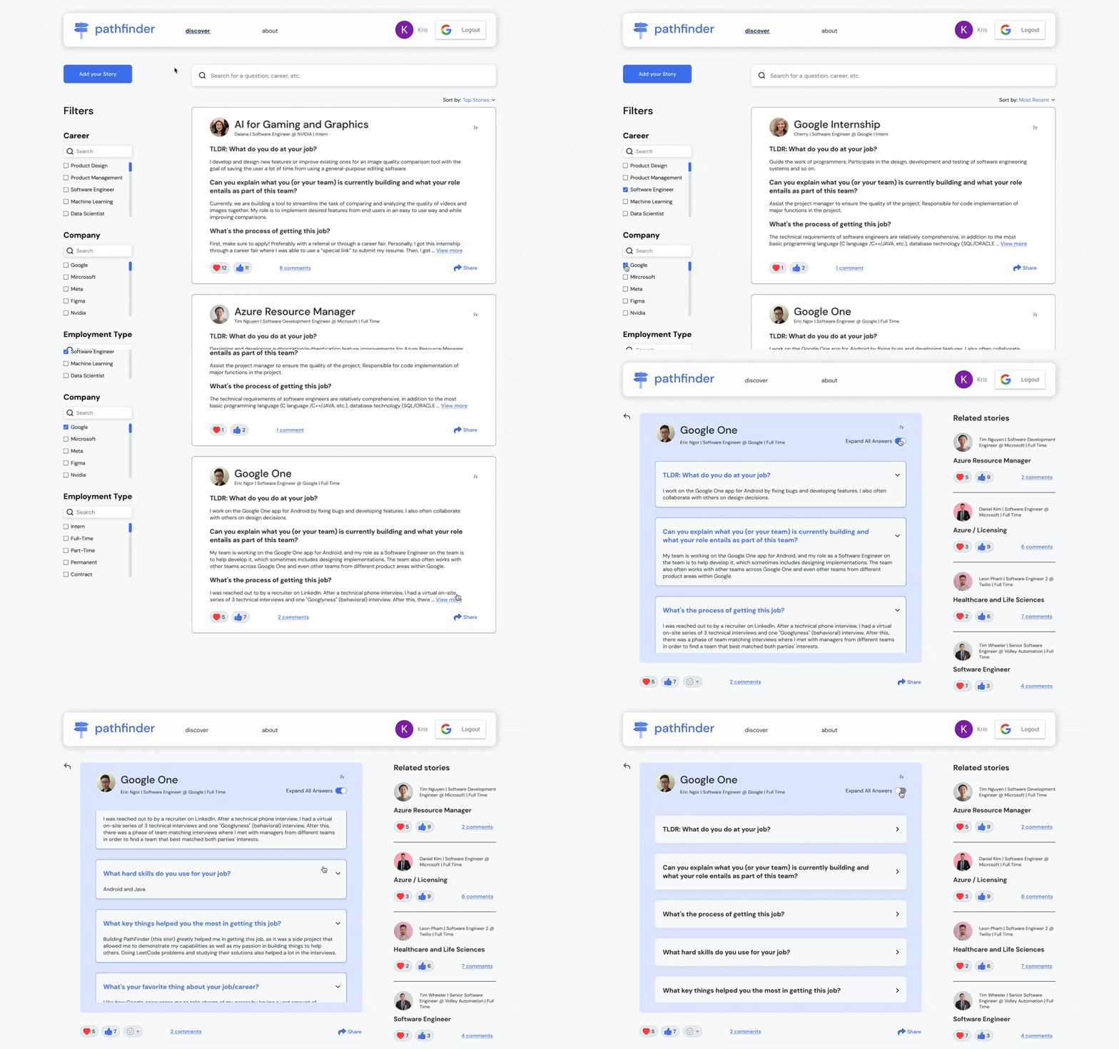
Website prototype
Context
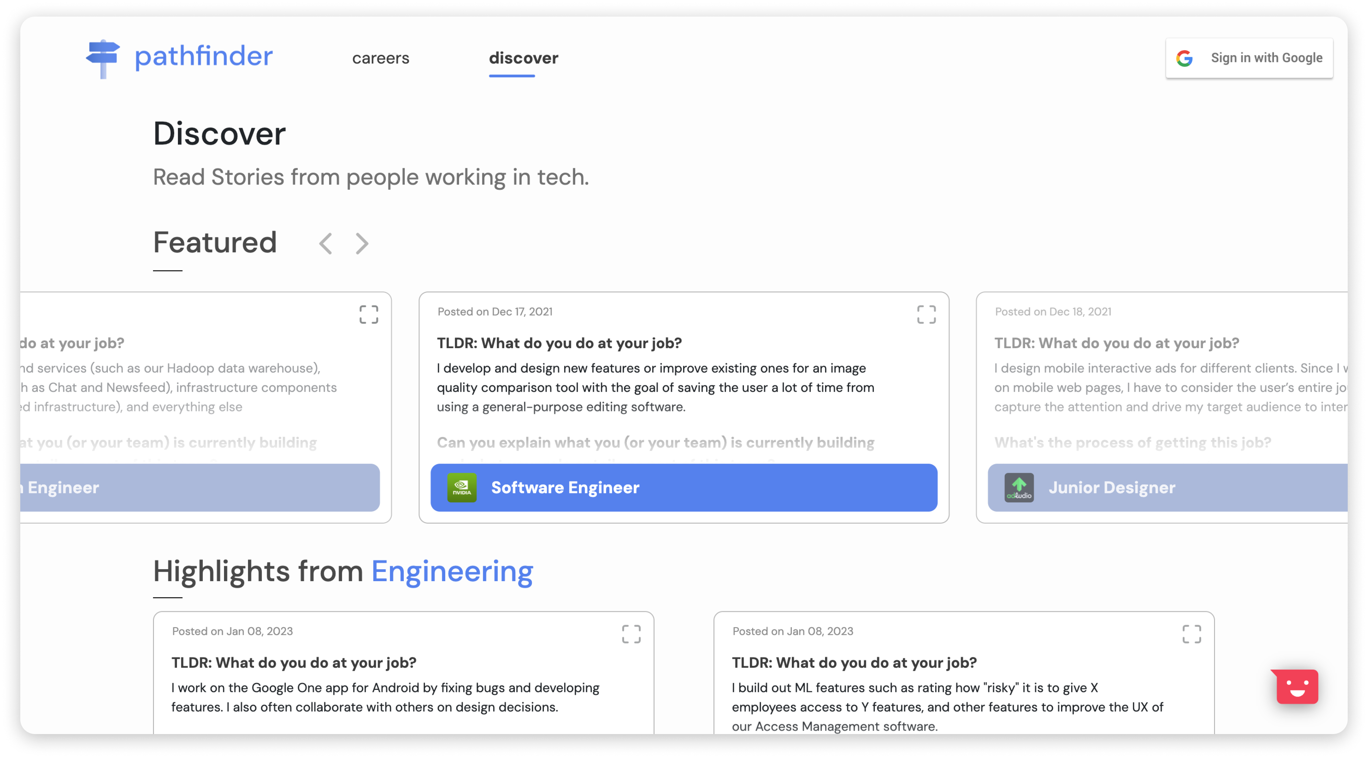
The Discover page provides professionals' stories to get a glimpse of their career experiences
PathFinder launched the site in 2022 with a feature called Stories on the Discover page. This feature allows professionals to post their career experiences with commonly asked questions in an FAQ format. It also allows students and career switchers to save time questioning what skills align with them.
Business opportunity and customer problem
PathFinder has no engagement on the Discover page and students were confused and dissatisfied with the page
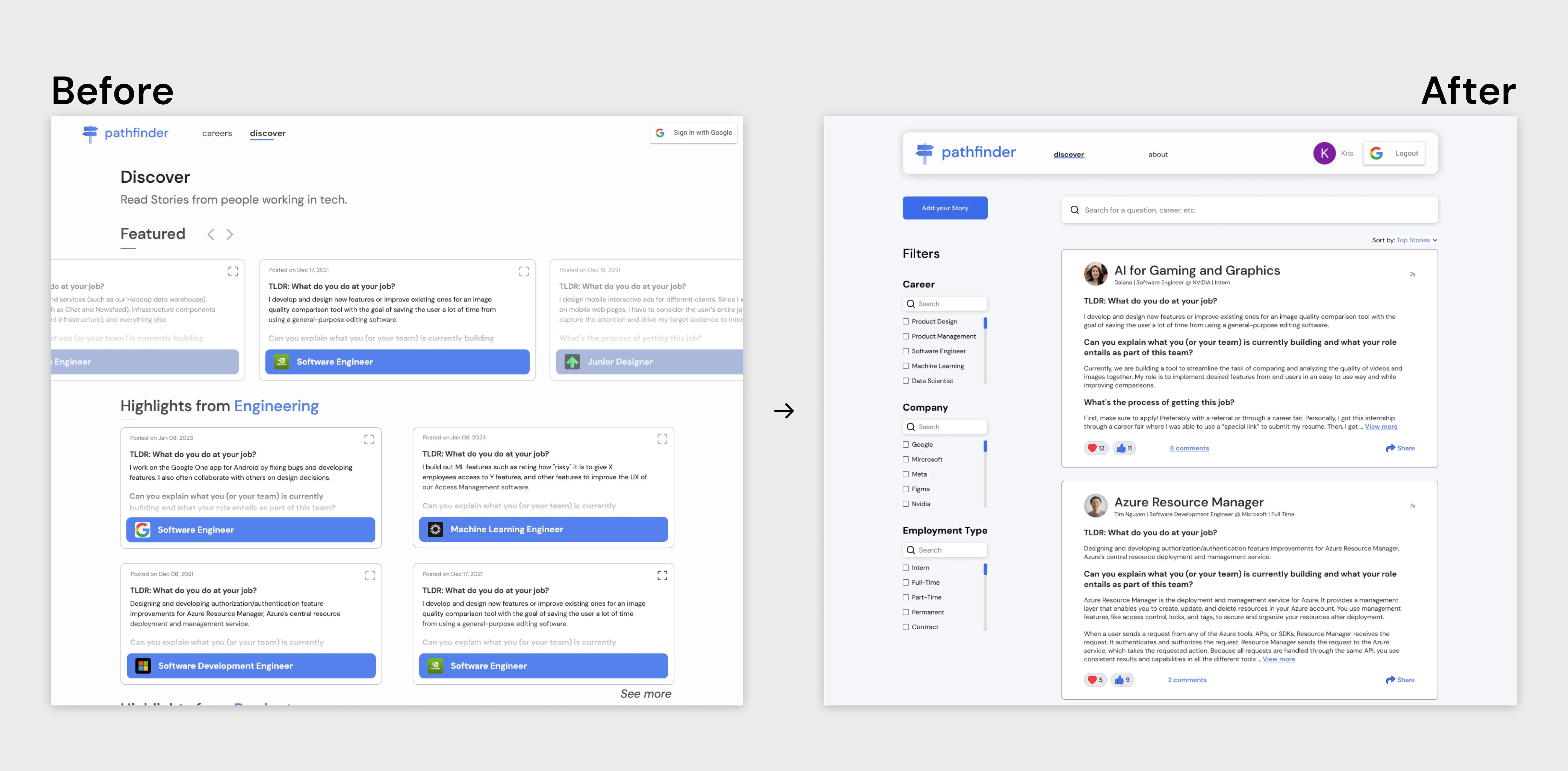
Through previous usability testing, we discovered that all students said that the sidebar page was cluttered. To my surprise, they were confused about clicking the arrow button to find and view the full post. They wanted to filter by the company. The product manager saw no engagement via Hotjar, which he proposed to find a way to improve the site's engagement.
Challenges
What are the challenges?
 Limited time
We work through an Agile process, which requires us to design within a tight deadline and narrow down the scope for the engineers to quickly build it.
💸 Limited budget
PathFinder is slowly growing as we have no funds. Thus, we only have limited resources to design and develop our designs.
Goals
What are the goals?
🎯
Validate the business idea
📈
Drive engagement
👀
Increase discovery
🔍
Improve discovering career stories
Research summary
Students and professionals did not want to click more to find a post and wanted to filter and search it quickly
To understand why PathFinder can't increase engagement and further validate the Discover page, I started with research by conducting 5 user interviews about navigating through the live site and their experience finding a career path, 2 empathy maps, and 4 SWOT analyses. This helped my team and I brainstorm solutions to tackle the problem of the Discover page.
Here are the key insights:
 Students and professionals still need career guidance
 Suggest to add filters to search for a specific story quicker
 Students and professionals perceived the Discover page as a job board by the layout
 Competitors provided filters and a search bar to navigate for a particular post at ease
Ideation
Redesign the Discover page to drive engagement and improve the discovery experience
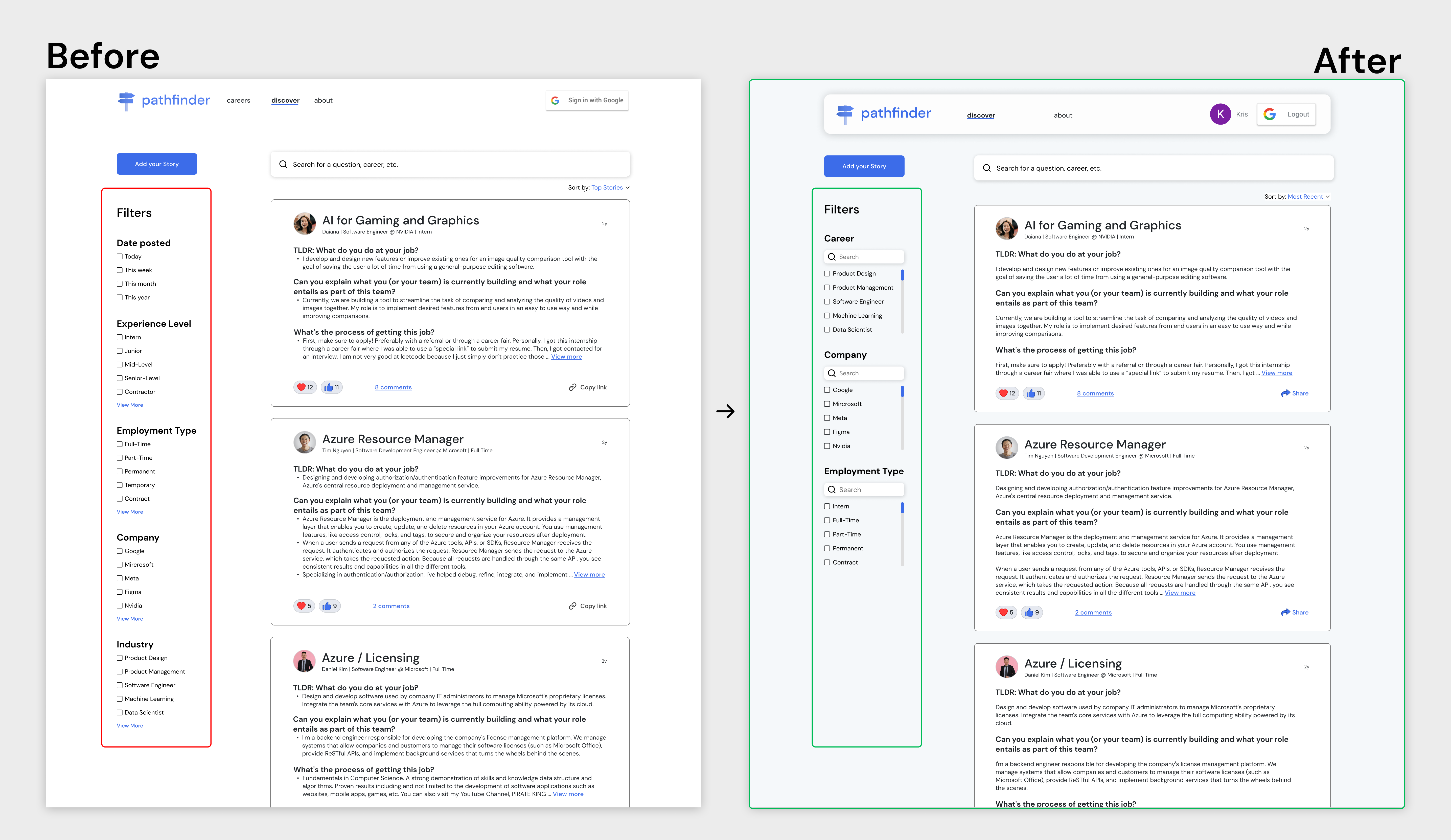
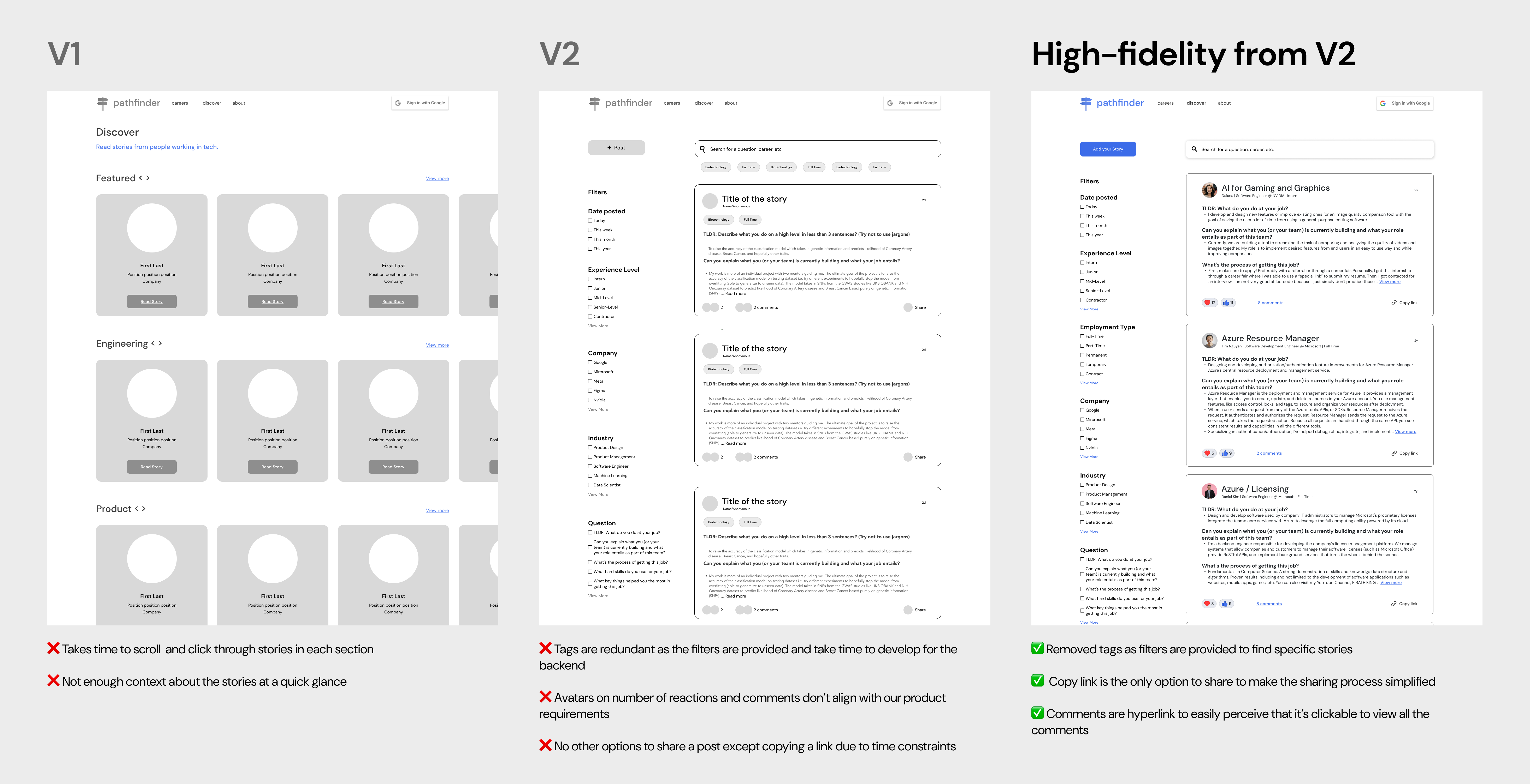
From research, students and professionals perceived the Discover page as a job board. They suggested adding filters and a search bar to reduce the number of clicks to find a post. Some also wanted to filter by "Company," which the previous filter design didn't provide.
I began designing our solidified solution on mid-fidelity wireframes in two different versions for the team and engineers to see how it would function. After considering the technical constraints, I used version 2 to create high-fidelity wireframes for usability testing to have the participants interact with it as if it were a launched product.
Round 1 of design iterations
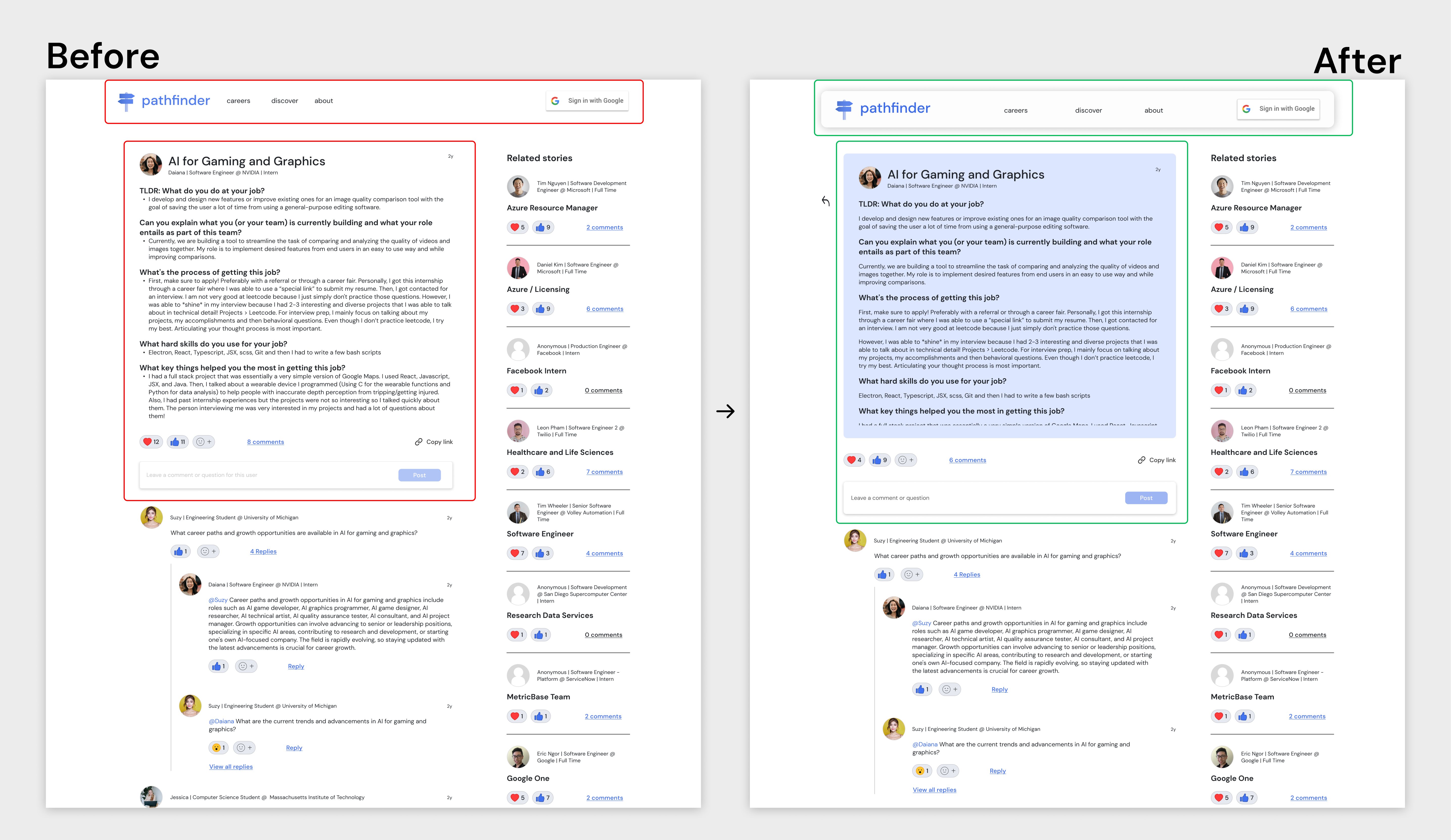
Iterations from feedback on usability testing on high-fidelity wireframes for better clarity and experience
Due to time constraints, I partnered with a designer to conduct round 1 of usability testing with 5 participants on our Figma prototype. This would validate our designs, point out any confusion with the site, and get an understanding of their initial impression of the site.
Here are the insights:
🫡 Wanted to sort the posts and wouldn't use the "Questions" filter
Improvements


Round 2 of design iterations
Another round of iterations of testing on high-fidelity wireframes for validations and interview feedback
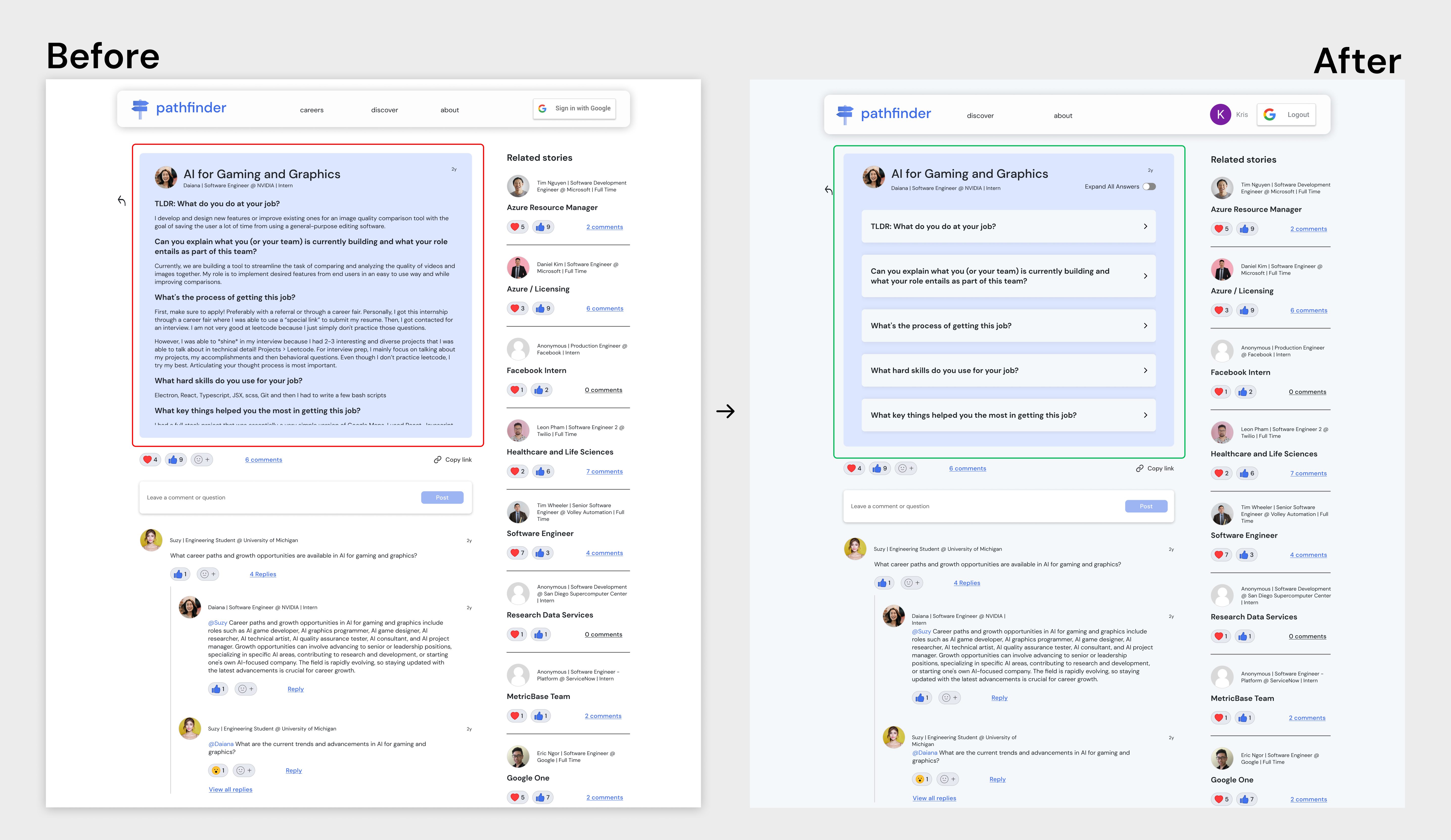
After the designer and I iterated screens from round 1 of usability testing, I proposed doing round 2 of usability testing with 5 participants to validate our high-fidelity designs. I wanted to ensure more room for improvement in the visual and interaction design before finalizing the design for launch.
Suddenly, I discovered that due to technical and time constraints, I had to go through more rounds of iterations before launching it. Thus, we narrowed the scope to align with the product manager's requirements.
Here are the insights:
 Didn't care about the "Date posted" filter
🙄 Didn't want to read through all the answers at once
Improvement


Design handoff
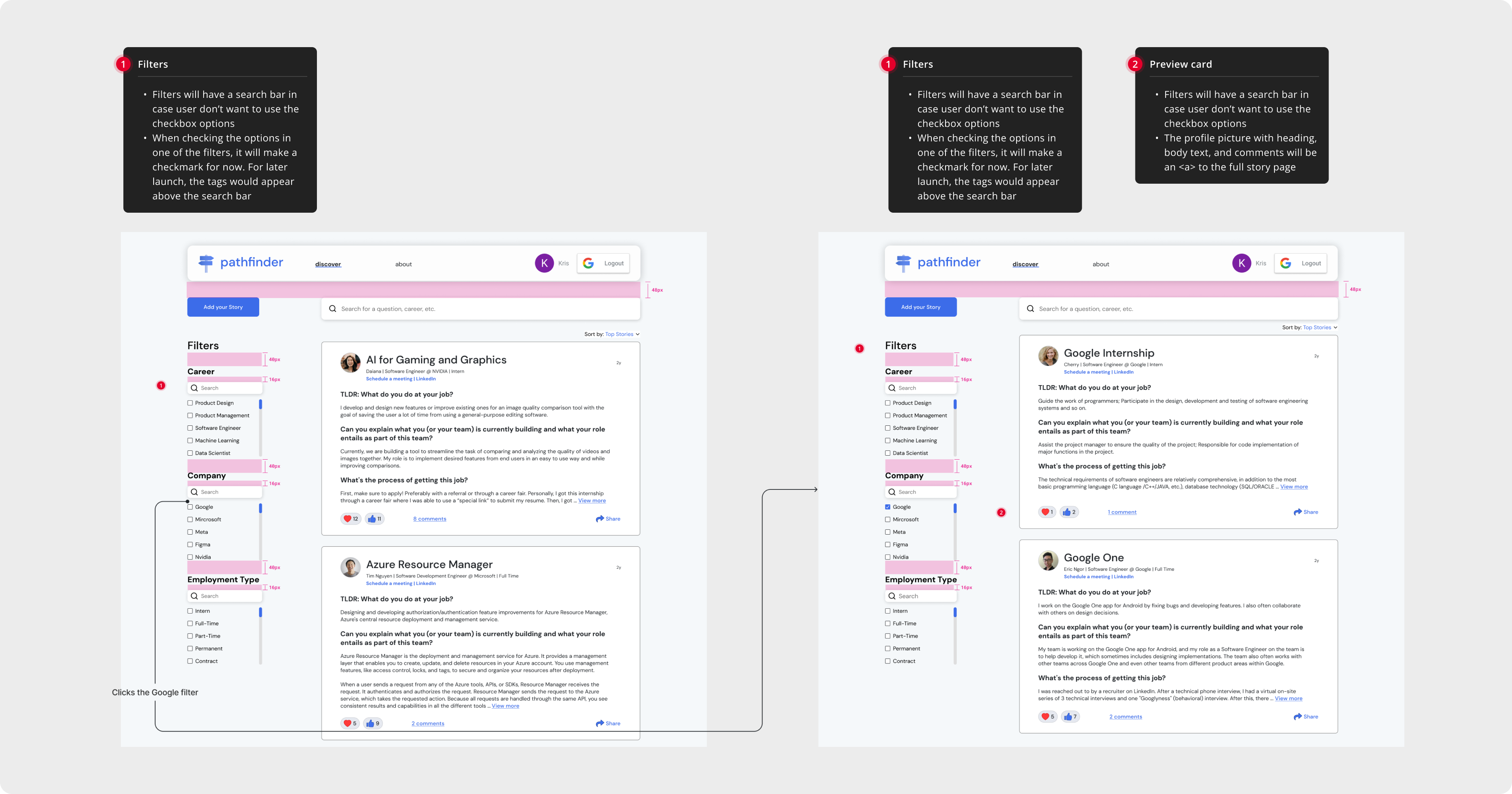
Scrutinize the design to foster smooth engineering collaboration
I kickstarted documenting design specs by using Figma to leverage Figma's new component properties to speed up the collaboration and foster smoother engineering collaboration with clear annotations and spacings. With the engineers, I wanted to ensure that they followed the component library, style guides, and auto-layout.
Final design
Where we landed: Redesigned Discover page to advance the post discovery experience
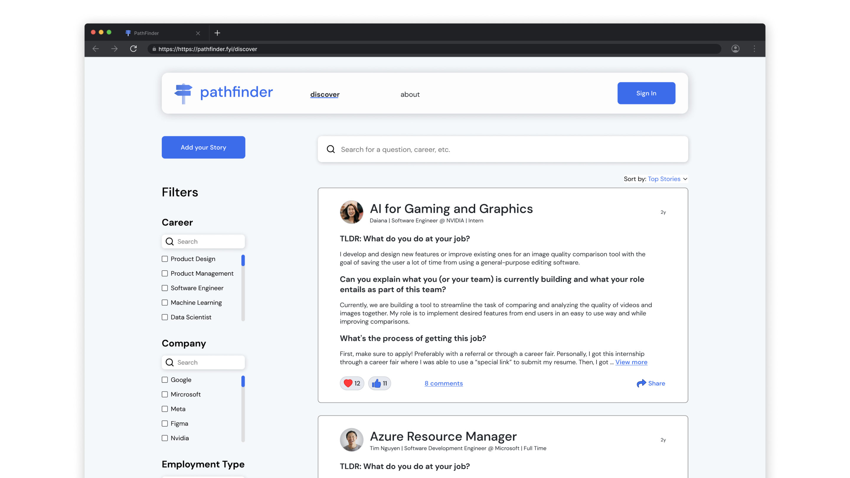
Discover page
Explore the community through professionals' stories and choose a story you are interested in learning about their career experience

Discover page website prototype
Results
What are the results?
We evaluated the product through usability testing, Hotjar, and partnerships with two companies. The product manager decided to partner with professional community-type companies because students from user research said that they refused to pay for premium plans. Thus, by partnering with companies, we can potentially increase the number of consumers who use it and generate revenue.
100%
task completion rate
80%
satisfaction rate
20%
reduced bounce rate
Reflection
What I learned?
💭 Consider narrowing down the scope due to time constraints
As PathFinder is an early-stage startup, it's common for a startup to have a small scope and keep it agile. Although I wanted to design more features, I had to consider what to prioritize due to time constraints.
⚖️ Balance between user feedback and technical constraints
Although it is important to design by customers, it's also important to design by putting myself in the engineer's shoes to make the designs feasible.
Next Steps
✍🏻 Design more features and get feedback
We are excited to see what happens next for our partnership with the two companies. So, we need further feedback on what the two companies are looking for to keep improving and grow our customers' frequent use of it.
📊 Measure success
We would still need to measure our KPIs, which are user retention and the number of users active on the Discover page.
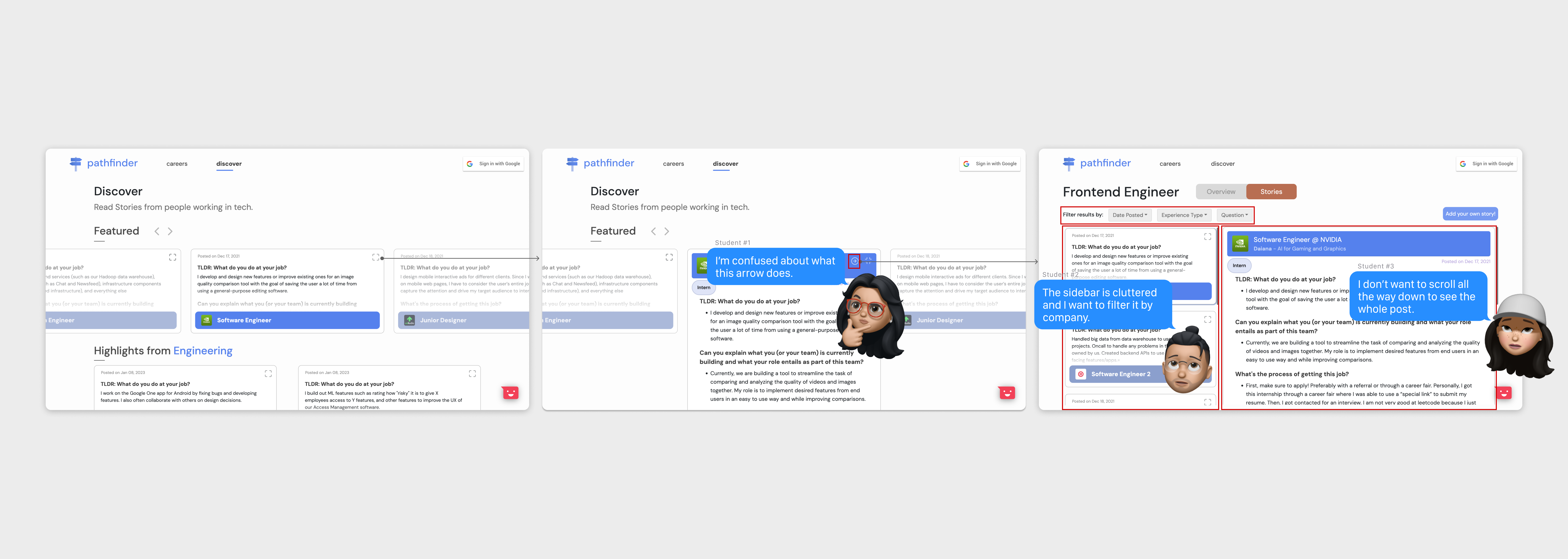
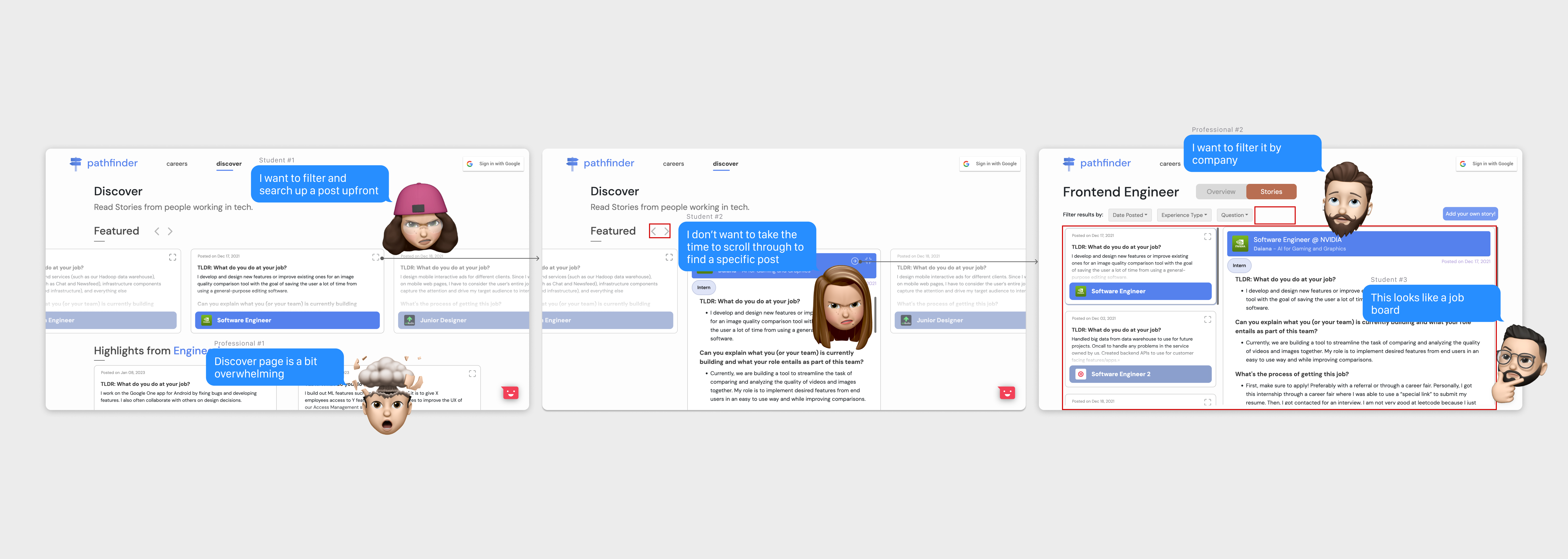
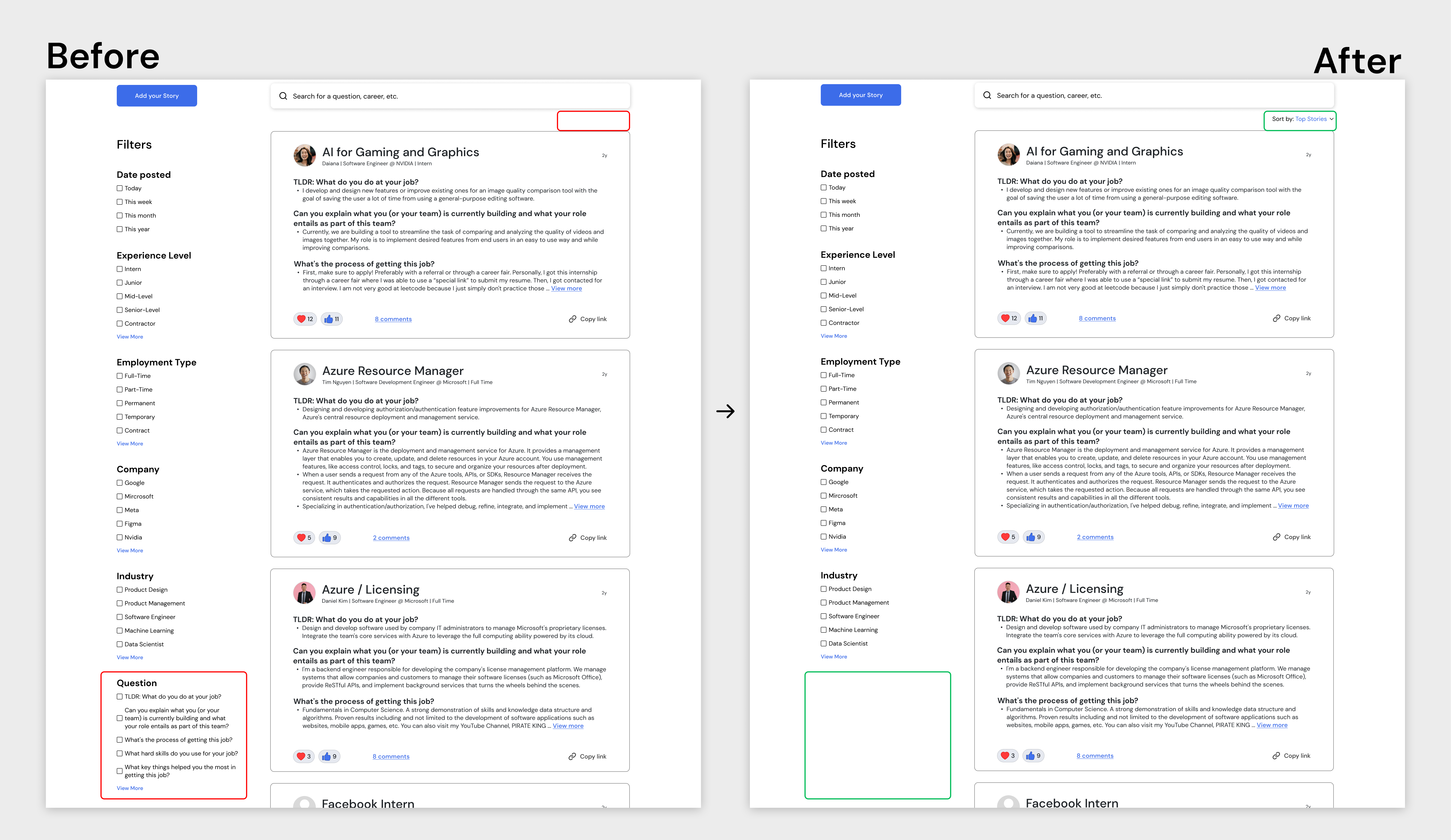
 Didn't know where to scroll and the post is not visually appealing