PathFinder
Leveraging AI for instant career insights for students and career switchers
Role
UX/UI Designer - Product Strategy, Research, UX Design, Prototyping, Visual Design, Design system, Handoff Documentation
Team
1 Product Manager, 2 UX/UI Designers, 7 Engineers
Duration & Status
4 months
Launched on Mar 2024
TLDR
PathFinder is an early-stage startup on a mission to improve transparency in career paths for students and career switchers transitioning into or starting a career to pursue their passions.
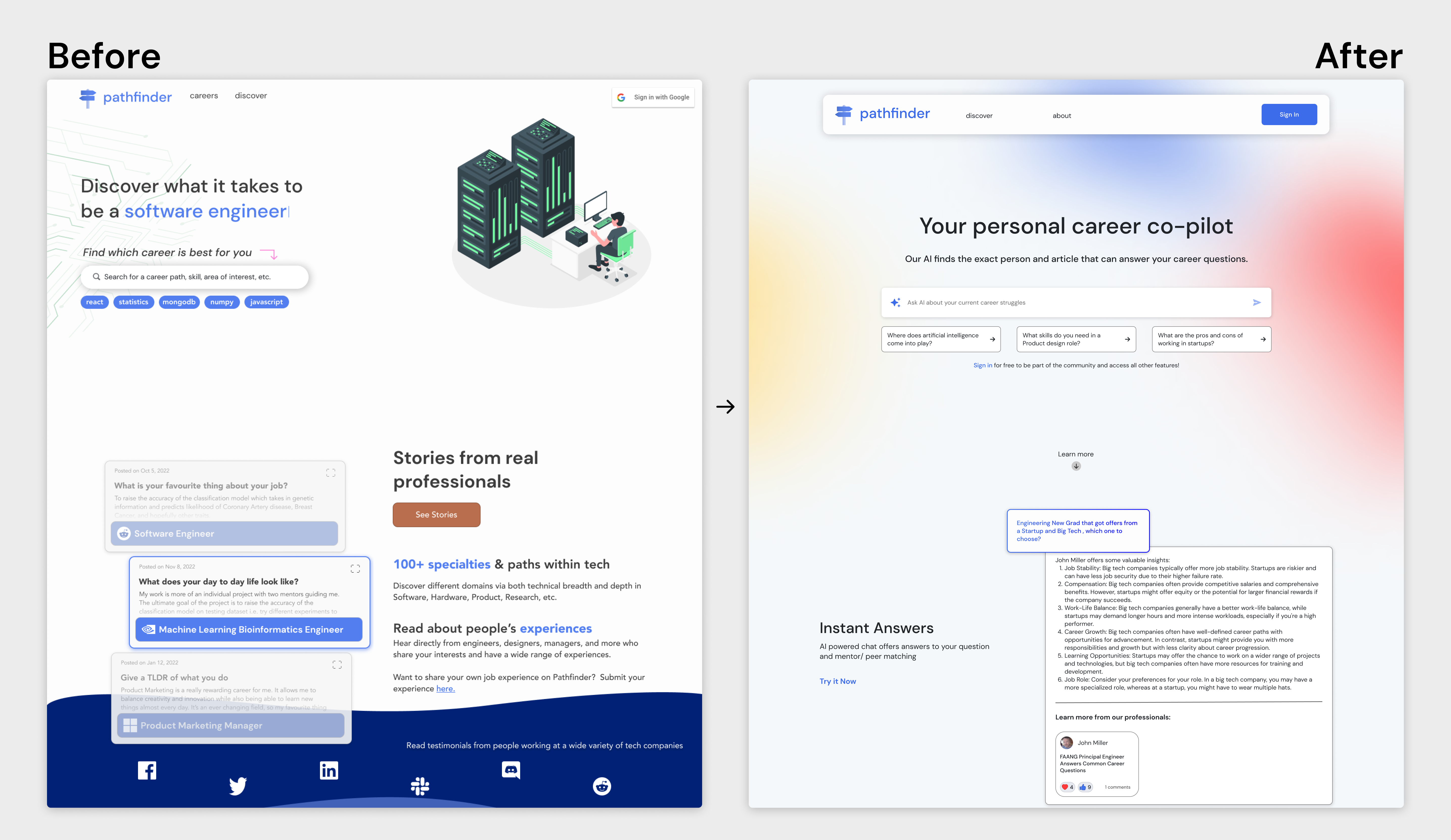
As a UX/UI Designer, I spearheaded the redesign of the landing page and integration of generative AI to encourage people to visit the site and increase product awareness.
This results in 100+ sign-ups, an 80% satisfaction rate, and a CES of 96% for using the AI-powered search.
100+
sign-ups
80%
satisfaction score
96%
CES for using the AI-powered search

Final website design prototype
Context
PathFinder provides insights about different careers that best fit for students and career switchers
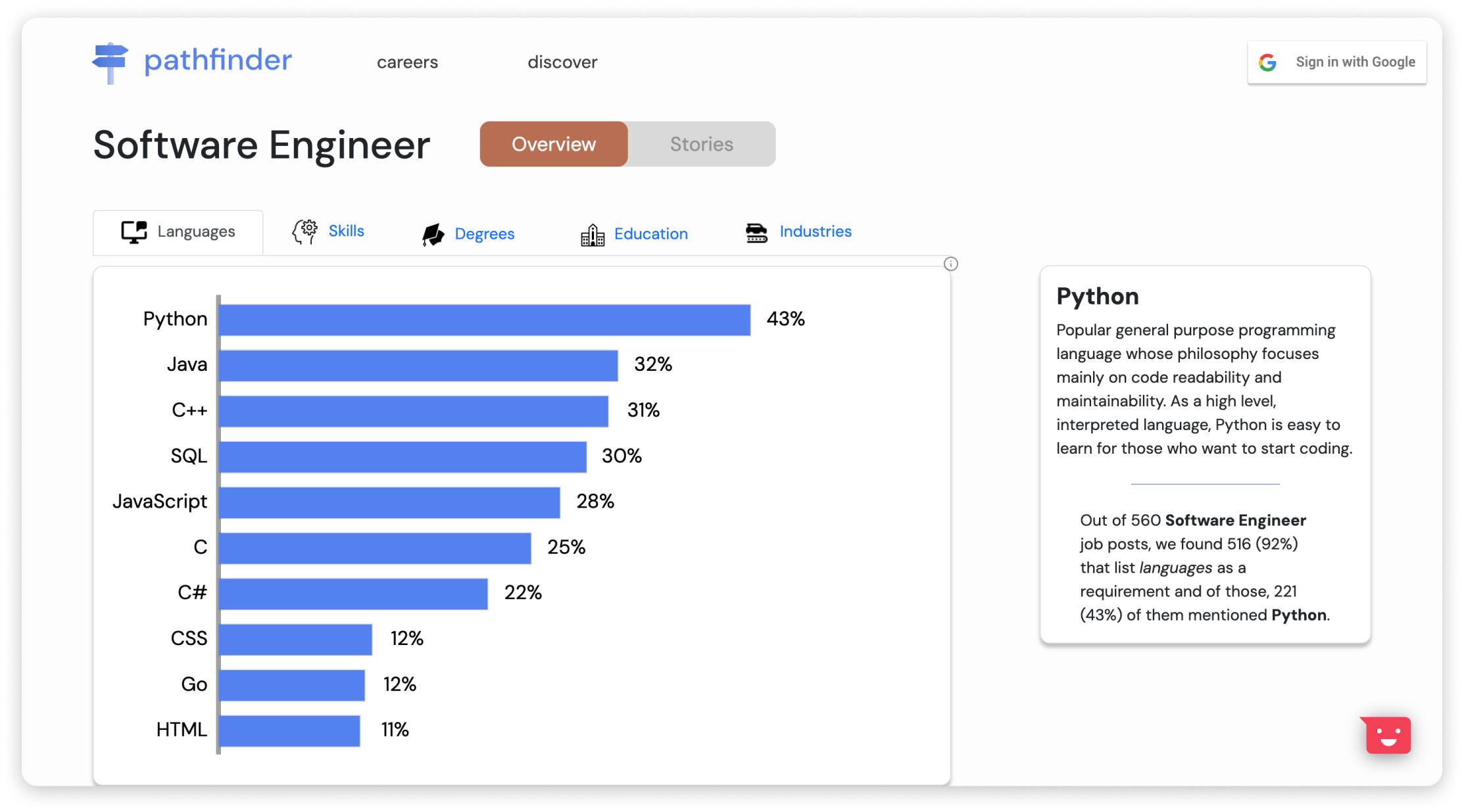
PathFinder launched the site in 2022 and one of the features is an overview feature that visualizes data about each career's skills, education, degrees, and industries. This would allow students and career switchers to dive deeper into their potential career choices, determine what skills align with them, and plan their future careers.
Business opportunity
PathFinder has a 19% clickthrough rate and 40% reduced bounce rate
After launching the site, we expected to gain engagement, but the product manager saw through Hotjar that the search bar had a 19% clickthrough rate, and the landing page and the Careers page had a 40% reduced bounce rate. This results in fewer active customers and less engagement on the site.
Challenges
What are the challenges?
⚛️
No design system
PathFinder had no design system and the designs were not WCAG 2.1 AA compliant.
Time
Working through an Agile process requires us to consider a tight deadline and narrow down the scope.
Budget
We had to design and develop our solutions with a limited budget.
Goals
What are the goals?
🎯
Achieve product-market fit
Make PathFinder a valuable tool that students and career switchers can enjoy and receive career insights.
Increase engagement
Attract students and career switchers to continue using the site as an essential product.
🧭
Help students to explore different career paths
Help students find what career would align with them.
Get the questions answered quickly
Allow students to find answers faster and save time for their career goals.
Understand and validate the problem
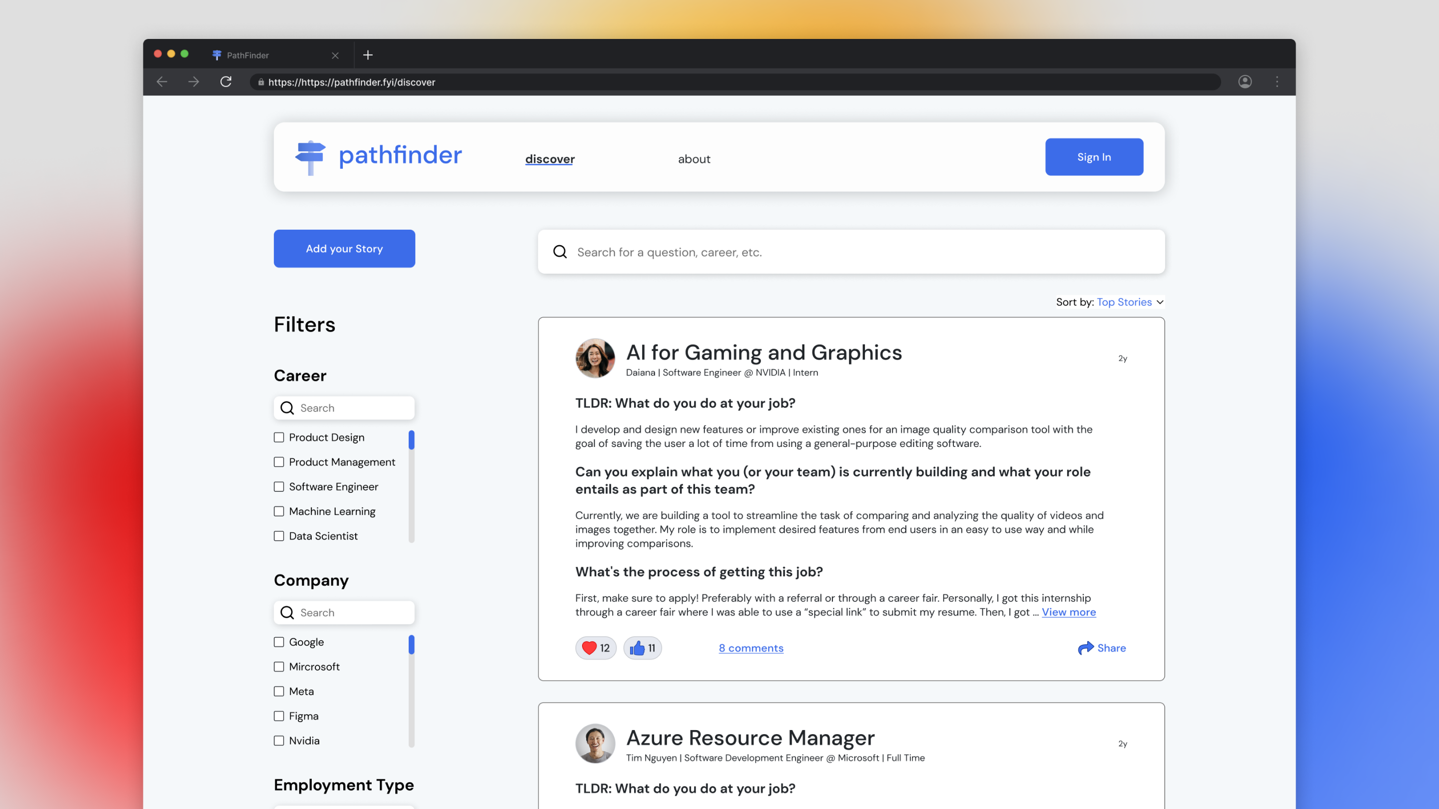
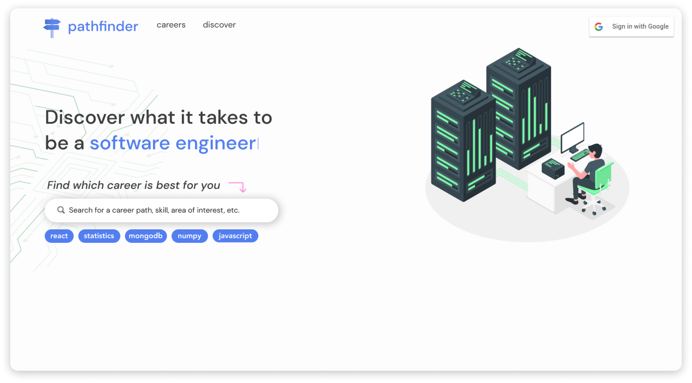
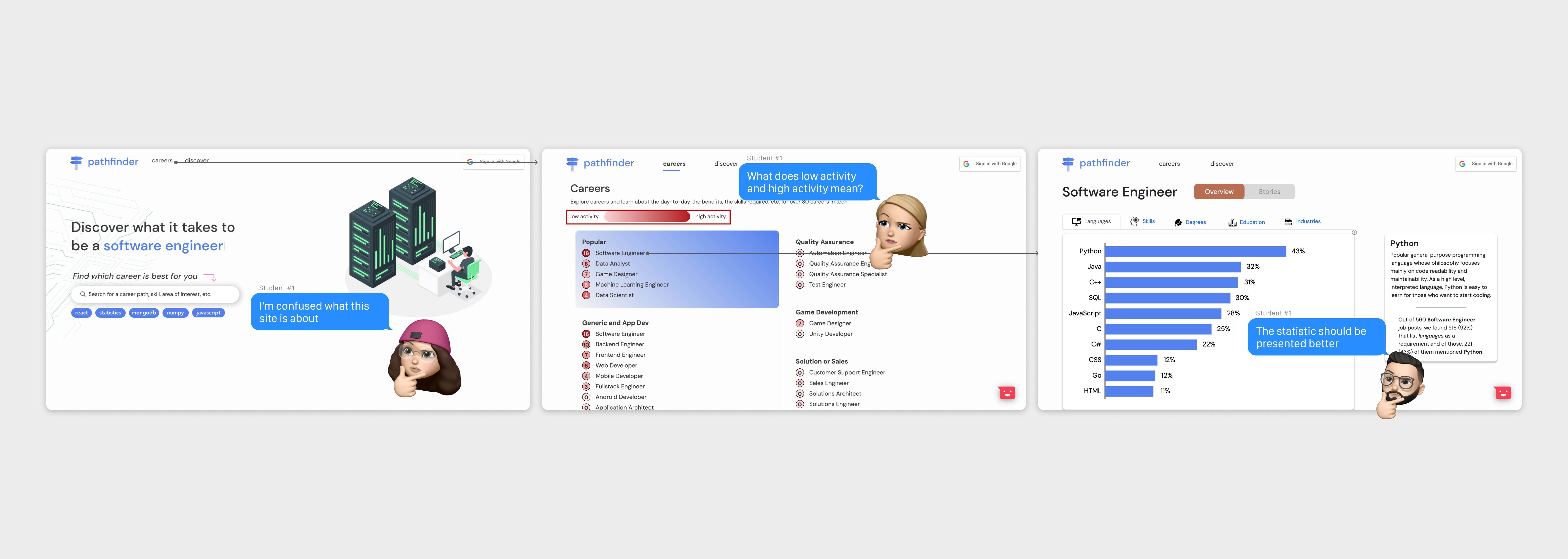
Students and professionals find a lack of content on the site and were confused about what it is about
PathFinder’s low product market fit led me to conduct 5 interviews with tech students and professionals to learn about their career paths, issues with the site, and how we can increase engagement.
These enabled us to brainstorm potential solutions that could solve the problem and help us reach our goal of having PathFinder become a valuable product for students, career switchers, and professionals.
Here are the key insights:
Confusion about the site
Students and professionals were confused about what the site is about when they landed on the homepage.
Career guidance
Students and professionals still need more career guidance through their career journey
More content
When going through the site, they want to see more posts about the professionals career experience
Refuse premium plans
Students refuse to pay for premium plans for a high cost to upgrade to unlimited features
Scoping and trade-offs
Prioritizing generative AI and landing page redesign to achieve its product-market fit and increase engagement
Through weekly meetings, I shared the research insights with the team in-depth and kicked off with brainstorming to rethink how we can increase engagement and make PathFinder a valuable product. While discussing solutions, I considered narrowing the scope of feasible features for the engineers within the timeline.
After considering the budget and technical constraints, we decided to prioritize the generative AI feature and redesign the landing page as AI is rising and all align with the product requirements.
Top ideas with rationales:
Integrate Generative AI
AI is expanding and saw that one of the competitors achieved its product market by generative AI.
Redesign the landing page
Students and professionals didn't understand what the site was about when they landed on the page.
Onboarding page
It takes a lot of time to develop
Redesign the Careers page
It takes time to redesign the Careers page.
Design solutions
Applied our solidified ideas to explorations and iterations
One of my biggest challenges was understanding how AI works, as this is my first time designing generative AI. I partnered with a designer to explore different designs of the generative AI feature and the redesigned landing page in mid-fidelity wireframes to understand the website's structure before diving into the details.
We went through rounds of iterations through two usability tests via Zoom on high-fidelity prototypes and weekly team meetings to validate whether the design was easy to use, observe any confusion, and align with the team’s requirements before launching the product. Designing in mid-fidelity first was convenient to validate our designs before making significant changes quickly in high-fidelity wireframes.
Here are the insights from round 1:
 Not knowing which part is the AI chat box to scroll
Improvements
✅ Designed the FAQ format so that students and career switchers can click the question they want to see the answer to
✅ Added a blue background to contrast with the questions and make it consistent with the brand
Here are the insights from round 2:
 More visuals on the design, removed careers page, and more context about the AI
Improvements
✅ Redesigned the nav bar and added gradients to the landing page to make it more visually appealing to students and career switchers
✅ Added a new section about what the AI does for more context

📚 Add articles and remove "Like" and "Dislike" icons and the down arrow icon
 It takes more clicks to click on each question to see all the answers
Design system
Establishing PathFinder's first design system for consistency and efficiency across all screens
PathFinder did not provide a design system and the visuals were not WCAG 2.1 AA compliant. So, I took the initiative to establish its first design system to keep our visual designs consistent across all screens, which could potentially increase engagement. This also helps save time and increase design efficiency for the engineering team, the designer, and me when designing high-fidelity wireframes for later.

Design system working in progress
Design handoff
Scrutinize the design to foster smooth engineering collaboration
As we are improving the visual design and creating new components, I kickstarted documenting design specs by using Figma to leverage Figma's new component properties to speed up the collaboration and foster smoother engineering collaboration.
Final design
Where we landed: Providing AI-driven and personalized guidance for career path navigation
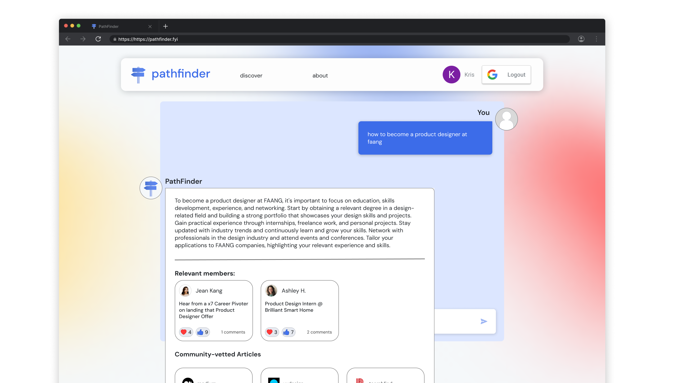
Generative AI
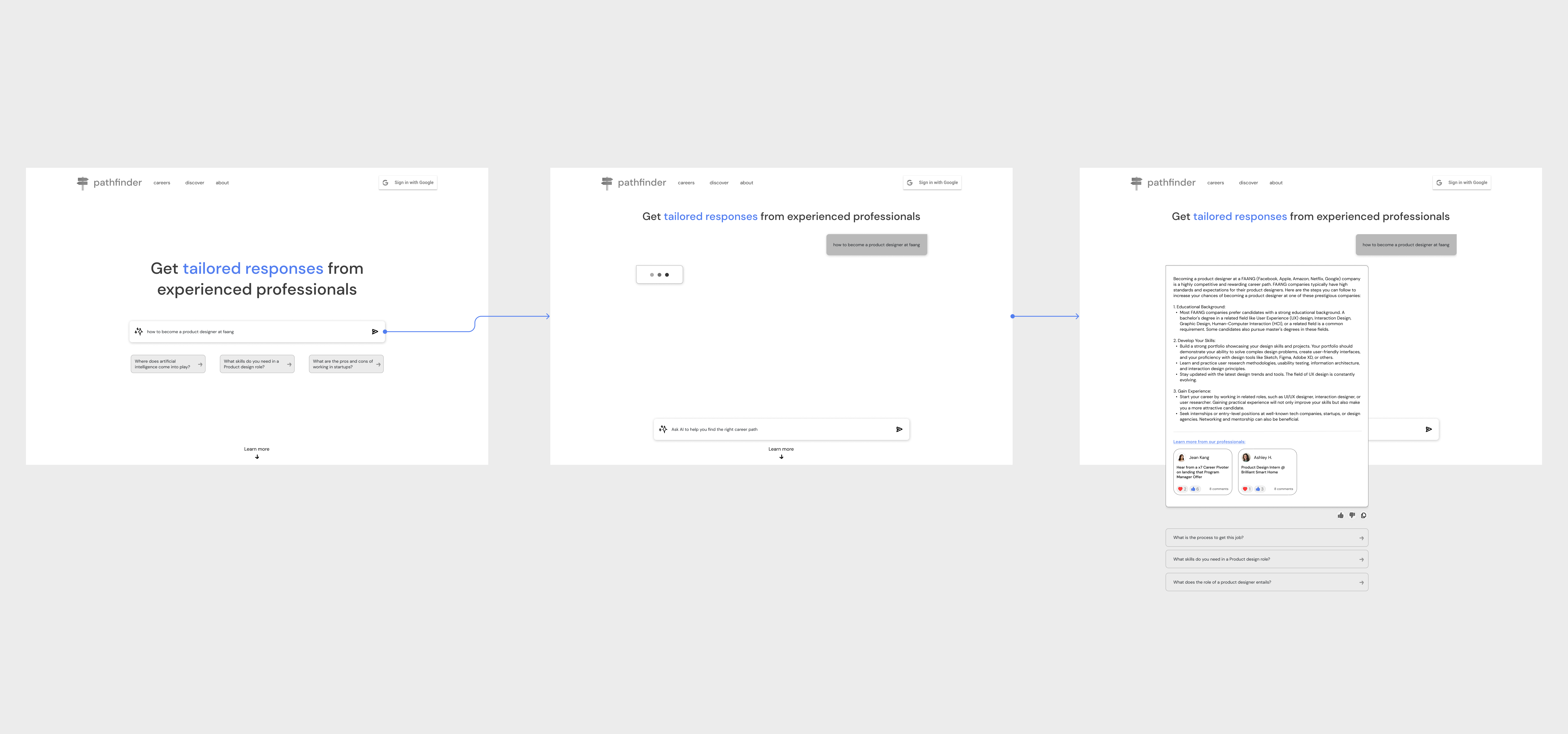
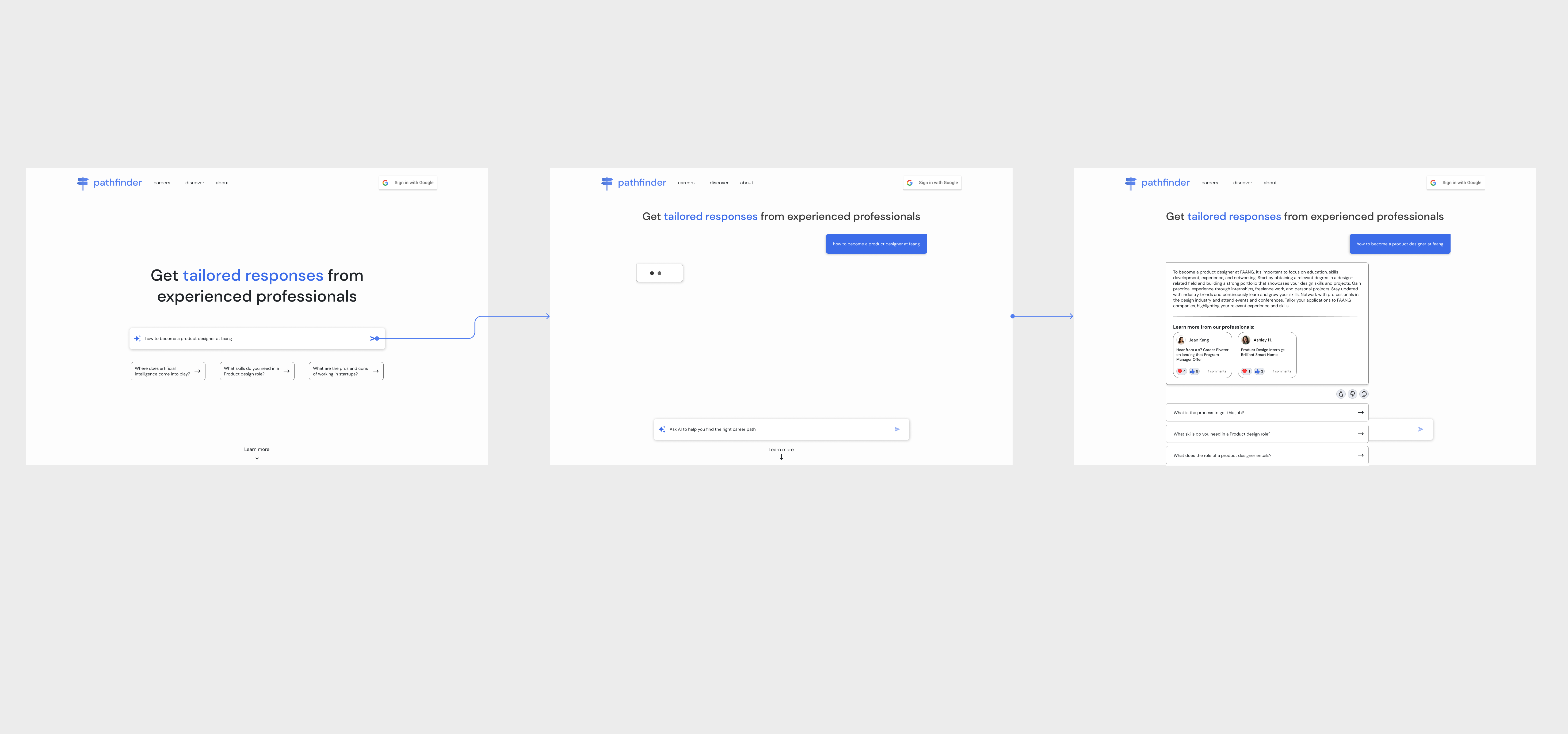
Type in the career question with generative AI to get your answer to your inquiry instantly and learn more about a professional that is relevant to what you are looking for.

Generative AI prototype
Results
What are the results?
We evaluated the product through usability testing and partnerships with two companies. Although PathFinder is a B2C startup, the product manager decided to partner with professional community-type companies because students from user research said that they refused to pay for premium plans. By partnering with companies, we can potentially increase the number of consumers who use it and generate revenue.
100+
sign-ups
80%
satisfaction score
96%
CES for using the AI-powered search
Reflection
What I learned?
⏳ Consider narrowing down the scope due to time constraints
As PathFinder is an early-stage startup, it's common for a startup to have a small scope and keep it agile. Although I wanted to make some design decisions, I also had to consider the technical and time constraints.
🗣 Explain the importance of Figma's features
I partnered with a designer unfamiliar with using Figma. So, I taught her how to use components and auto-layout, which she got the hang of and we finished our designs faster than before.
Next Steps
 Design more features and get feedback
As we partner with 2 companies to generate revenue and grow our customers, we will get feedback on the next steps to design that align with their needs. Also, the product manager plans to interview with VCs to see whether we can generate funds.
📈 Measure success
We would still need to measure more of our KPIs: user retention and the number of active users using the AI chat. We are still deciding what analytic tool to use, but we currently use Hotjar.



 Overwhelmed by a bunch of text in Jean Kang's full story page